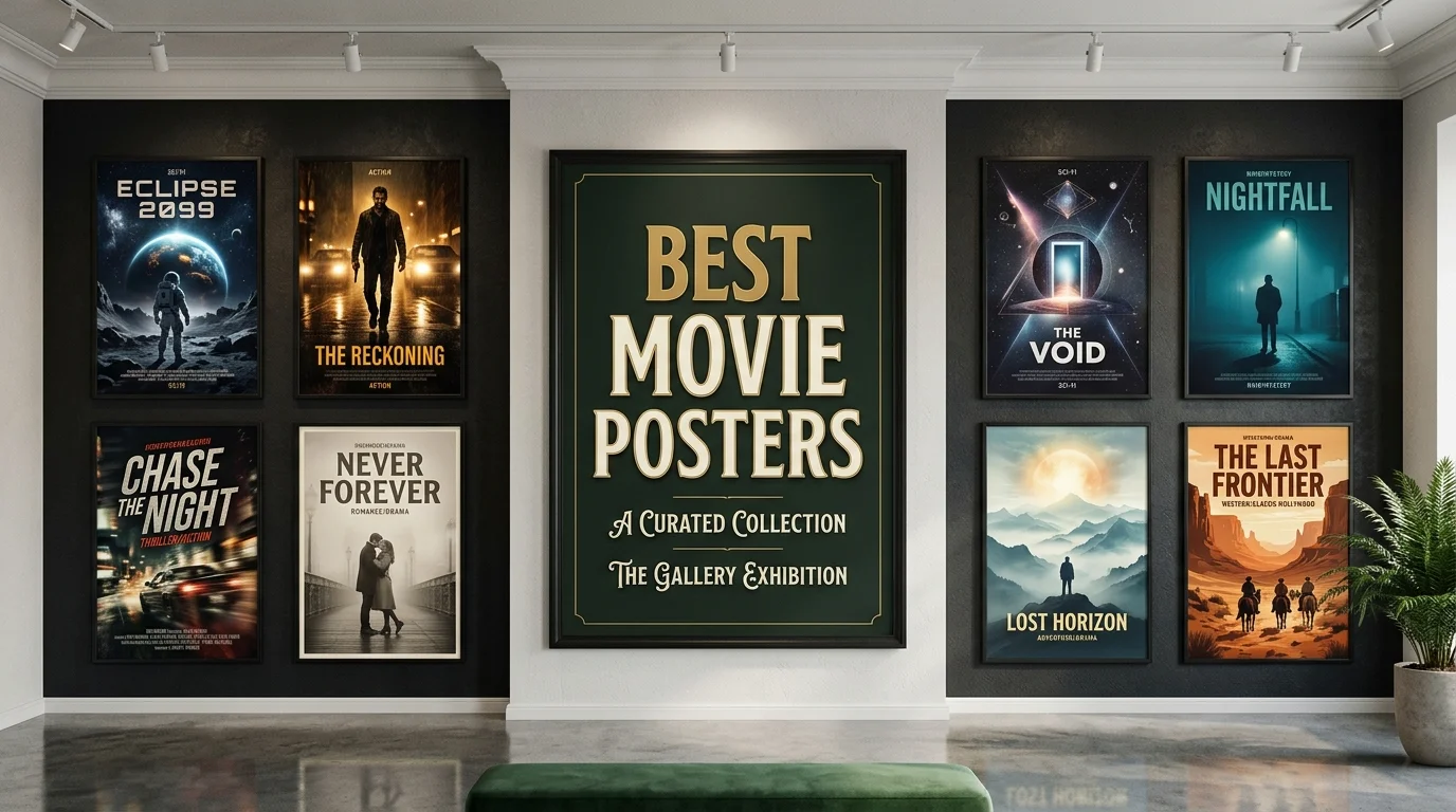
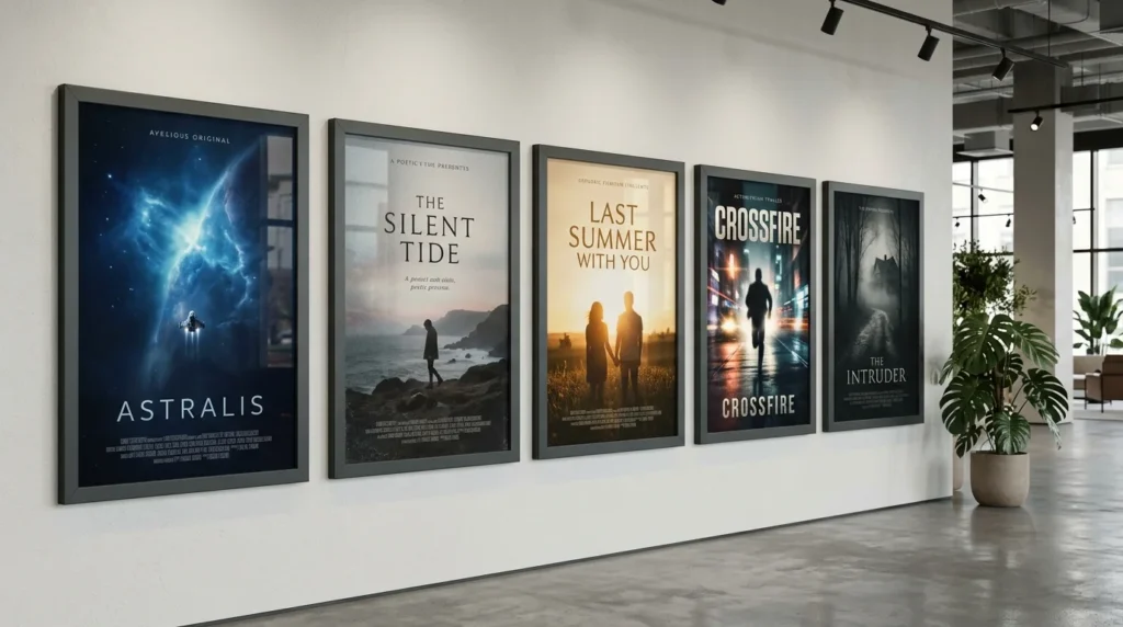
The best movie posters do more than advertise a film. They create curiosity before a viewer knows the story. Great designs also survive long after their theatrical campaigns disappear.
Some rely on a single unforgettable image. Others use typography, color, scale, or negative space to establish the film’s mood. This ranking highlights 12 designs that remain especially effective for American film fans.
Quick answer: Vertigo takes our top spot because its spiral turns psychological unease into one instantly recognizable image. Jaws follows with unmatched suspense and visual storytelling. Alien, The Godfather, Pulp Fiction, and Parasite also show how one strong concept can define a film before anyone enters the theater.
Movie Poster Ranking at a Glance
| Rank | Film | Year | Defining Strength | Best For |
|---|---|---|---|---|
| 1 | Vertigo | 1958 | Graphic simplicity | Design history |
| 2 | Jaws | 1975 | Suspense and scale | Instant recognition |
| 3 | Alien | 1979 | Minimalist mystery | Horror and science fiction |
| 4 | The Godfather | 1972 | Symbolic branding | Timeless simplicity |
| 5 | Pulp Fiction | 1994 | Pulp-magazine styling | Pop-culture impact |
| 6 | Jurassic Park | 1993 | Logo-driven identity | Blockbuster branding |
| 7 | The Silence of the Lambs | 1991 | Disturbing symbolism | Psychological horror |
| 8 | Star Wars | 1977 | Epic illustrated spectacle | Adventure |
| 9 | The Exorcist | 1973 | Atmosphere and restraint | Horror |
| 10 | Blade Runner | 1982 | Illustrated world-building | Science fiction |
| 11 | The Dark Knight | 2008 | Character-driven menace | Modern blockbusters |
| 12 | Parasite | 2019 | Mystery and social tension | Modern international cinema |
Key Takeaways
- Strong poster designs usually commit to one central visual idea.
- The most memorable examples communicate mood before plot.
- Simplicity often lasts longer than crowded cast montages.
- Typography works best when it reinforces the film’s identity.
- A poster can become culturally recognizable apart from its movie.
- Collectors should distinguish original theatrical prints from later reproductions.
How We Ranked the Best Movie Posters
This list considers visual impact, originality, cultural recognition, and each poster’s connection to its film. Historical influence also matters because some designs changed later advertising. Display appeal is considered, but it doesn’t determine the ranking.
The ranking focuses mainly on well-known U.S. theatrical imagery. International campaigns can look dramatically different from their American counterparts. That distinction matters when collectors search for a particular edition.
Magbuff readers interested in screen culture can also browse the Entertainment section. The site covers performers, franchises, characters, and other film-related subjects. That wider context helps connect visual promotion with the stories audiences remember.
1. Vertigo, A Poster That Makes You Feel the Movie
The Vertigo design turns dizziness and obsession into graphic form. Its spiral pulls the eye inward while simplified figures appear trapped by motion. The orange, black, and white palette makes the image difficult to ignore.
Designer Saul Bass worked with Alfred Hitchcock on Vertigo and later Hitchcock films. The Academy describes Bass as an influential figure whose stark minimalism shaped film graphics. His work shows that a poster doesn’t need photographic realism to feel cinematic.
Pros
- Instantly recognizable visual concept
- Strong connection to the film’s psychological themes
- Distinctive color and typography
Cons
- Less character-focused than modern studio posters
- Abstract style may feel unusual to casual viewers
2. Jaws, Suspense Explained in One Image
Jaws creates tension before the viewer reads anything. A swimmer moves across the surface while an enormous shark rises from below. The distance between them becomes the entire story.
Artist Roger Kastel originally created the image for Peter Benchley’s novel. Universal later acquired the artwork for the film campaign. Its basic structure has since inspired countless parodies and visual references.
The Library of Congress has called Kastel’s image one of the twentieth century’s most recognizable paintings. That reputation comes from clarity rather than complexity. Few promotional images explain danger so quickly.
3. Alien, Minimalism With an Unanswered Question
Alien avoids showing its creature directly. Instead, a strange cracked egg floats above a dark grid. The image creates questions instead of explaining what will happen.
Its famous tagline adds dread without revealing the monster. Black space dominates the composition and makes the green glow feel unnatural. That restraint separates it from louder science-fiction advertising.
The result still looks modern decades later. Many horror campaigns reveal too much through faces or creatures. Alien proves that withholding information can make an audience more curious.
4. The Godfather, A Logo Becomes a Cultural Symbol
The Godfather poster uses remarkably few elements. A hand controls puppet strings above the title, creating an immediate metaphor for power. The black background keeps attention on that symbol.
The design also works at several sizes. It remains recognizable on a theater display, book cover, shirt, or small digital thumbnail. That flexibility helped the imagery outlive its original advertising campaign.
Readers exploring memorable screen performances can visit Magbuff’s guide to Toby Kebbell movies and TV shows. His career shows how actors move between intimate dramas and effects-heavy studio productions. Poster campaigns must sell those different genres in equally different ways.
5. Pulp Fiction, A Poster Designed Like Popular Print Culture
Pulp Fiction presents Uma Thurman’s Mia Wallace like a worn paperback cover. The composition uses visible creases, bold lettering, and a deliberately inexpensive printed look. Those choices connect directly with the movie’s title.
The poster also reflects the film’s mixture of crime, coolness, and pop-culture references. Nothing about it resembles polished prestige drama advertising. Its identity feels specific, not interchangeable.
That specificity explains much of its staying power. The artwork became common dorm-room and home-wall decoration in the United States. Its appeal extends beyond collectors of traditional theatrical advertising.
6. Jurassic Park, When the Logo Does Almost Everything
Jurassic Park demonstrates the power of a strong emblem. The dinosaur skeleton, circular shape, and red background became inseparable from the movie. The poster does not need a cast montage to communicate scale.
That identity also carried over to merchandise and later franchise entries. Viewers could recognize the property before reading every word. Modern studios still chase that kind of visual consistency.
Its main strength is confidence. The campaign assumes that one symbol can create enough curiosity. That approach feels especially refreshing beside posters crowded with character portraits.
7. The Silence of the Lambs, Beauty Made Uncomfortable
The Silence of the Lambs places a death’s-head hawkmoth across a woman’s mouth. Her pale face and direct stare create immediate unease. The insect becomes both a visual barrier and a clue.
A closer look reveals additional detail in the moth’s markings. That layered construction rewards viewers who study the image. It also suits a movie built around observation, psychology, and hidden meaning.
The design feels elegant before it feels frightening. That contradiction makes it stronger. Horror promotion often succeeds when something familiar becomes subtly wrong.
8. Star Wars, Selling an Adventure Bigger Than the Screen
The original Star Wars campaign immediately promised scale and fantasy. Heroic figures, weapons, light, and distant spacecraft create an illustrated tableau of adventure. The arrangement feels closer to mythic fantasy than technical science fiction.
That choice helped audiences understand the emotional promise. The story could feature unfamiliar planets while still feeling accessible. Romance, danger, and heroism were visible before viewers knew the characters.
Film fans who enjoy franchise lore can also read Magbuff’s explanation of Shadowfax. Although it covers Tolkien rather than Star Wars, both franchises show how recognizable imagery supports fantasy storytelling. Distinct symbols help fictional worlds remain memorable.
9. The Exorcist, Horror Built From a Quiet Street
The Exorcist poster shows a man arriving beneath a streetlight outside a house. There is no monster, violent scene, or screaming face. Darkness around the figure instead creates uncertainty.
The composition makes an ordinary residential setting feel threatening. Strong black-and-white contrast directs attention toward one small human figure. That sense of isolation supports the movie’s supernatural tone.
It also demonstrates how restraint can sell horror. The viewer must imagine what waits inside the house. That imagined threat can feel stronger than an explicit image.
10. Blade Runner, A Whole Future Inside One Composition
Blade Runner uses illustrated characters, architecture, light, and vehicles to suggest a dense futuristic city. The poster promises both detective drama and science fiction. Its painted approach also gives the world a romantic quality.
The composition is busier than Alien or Vertigo. Yet each element supports the same futuristic atmosphere. The result feels expansive instead of cluttered.
That makes the design especially effective for world-building. Viewers understand that the setting matters as much as individual characters. The poster sells a place they have not seen before.
11. The Dark Knight, A Modern Blockbuster With a Clear Villain
The Dark Knight campaign often placed Batman against damaged urban imagery. The burning bat symbol became one of its strongest visual ideas. It turns destruction into branding without requiring a crowded ensemble.
Other campaign variations focused heavily on the Joker. Those designs reinforced the film’s conflict through smeared makeup, handwritten details, and disorder. The marketing felt connected to character rather than generic superhero action.
Readers interested in comic-book power and villains can also explore Magbuff’s guide to what makes Dr Doom so powerful. Comic adaptations depend heavily on instantly readable character identity. Strong promotional artwork can establish that identity before release.
12. Parasite, A Mystery That Refuses to Explain Itself
Parasite’s well-known poster places black bars across the characters’ eyes. Ordinary people stand within an expensive home and landscaped yard. Strange details prevent the image from feeling like a normal family portrait.
The visual censorship creates immediate questions about identity and social position. It also avoids spoiling the movie’s major shifts. That balance is difficult for a film built around surprise.
The campaign shows that recent poster design can still reward ambiguity. Audiences do not always need plot information. Sometimes the unanswered question is the strongest sales pitch.
What the Greatest Film Posters Have in Common
The strongest designs rarely summarize an entire plot. They identify one emotional promise and communicate it quickly. Suspense, wonder, danger, romance, or unease becomes the central visual idea.
They also remain readable from a distance. Jaws uses scale, Jurassic Park uses a symbol, and Vertigo uses motion. Those approaches work before viewers study smaller details.
Finally, memorable artwork belongs specifically to its film. A viewer could not easily move Alien’s egg onto another science-fiction campaign. That uniqueness is a useful test for any great promotional design.
Which Poster Is Our Top Pick?
Vertigo is our overall winner because its visual idea and film theme are inseparable. The spiral is attractive, unsettling, and easy to recognize. More than six decades later, the design still feels deliberate rather than dated.
Jaws is the stronger choice for pure storytelling speed. Alien wins for minimalist suspense, while Pulp Fiction has exceptional home-display appeal. Your favorite can reasonably change depending on what you value.
Collectors should also confirm which version they are buying. Original theatrical issues, reissues, licensed reproductions, and unofficial prints are different products. Condition and provenance matter even more when substantial money is involved.
Frequently Asked Questions
What are the best movie posters of all time?
Vertigo, Jaws, Alien, The Godfather, and Pulp Fiction are strong starting points. Each uses a distinctive concept rather than generic promotional imagery. Their influence also extends far beyond their original theatrical releases.
What makes a movie poster iconic?
An iconic design communicates its idea quickly and remains easy to recognize. It also reflects the tone or central tension of the film. Strong composition usually matters more than the number of characters shown.
Who designed the Vertigo poster?
Saul Bass created the celebrated graphic identity associated with Vertigo. The Academy preserves extensive Bass materials within its film and library collections. His minimalist approach influenced generations of film and graphic designers.
Who created the famous Jaws artwork?
Roger Kastel painted the famous shark image. It first appeared with Peter Benchley’s novel before Universal used it for the movie. Kastel also created memorable artwork for The Empire Strikes Back.
Are original theatrical posters valuable?
Some original examples can be collectible, especially scarce editions in strong condition. Value depends on authenticity, printing, rarity, demand, and physical condition. Buyers should research an item’s edition rather than judge price by the artwork alone.
What size are U.S. theatrical movie posters?
The modern U.S. one-sheet commonly measures about 27 by 40 inches. Older theatrical one-sheets can use different dimensions, including 27 by 41 inches. Collectors should measure an item before purchasing a frame.
Final Verdict
Great promotional art gives audiences a reason to wonder what happens next. The greatest examples achieve that before revealing much about the story. Their strength comes from choosing the right image rather than showing every possible image.
Vertigo earns first place for turning a psychological theme into timeless graphic design. Jaws comes closest because its threat is understandable within seconds. Alien deserves equal attention from anyone who prefers restraint and mystery.
Use this ranking as a starting point rather than a final rule. Explore Magbuff’s Entertainment coverage for more film, television, and character features. Then compare your favorites by visual impact, originality, and how well each design captures its movie.